Typography Basics
Typography defines the voice of your design. The 88 Component Library includes a complete typography system built for clarity, readability, and consistency across all components and layouts.
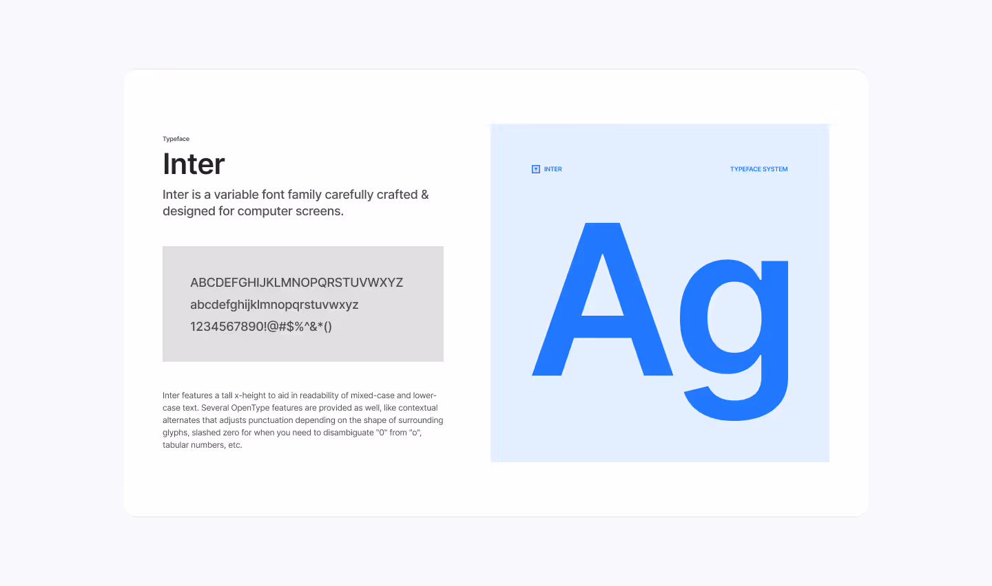
1. Typeface
The system uses Inter, a variable font designed for screens. It features a tall x-height for readability, multiple weights, and OpenType features like tabular numbers and contextual alternates.
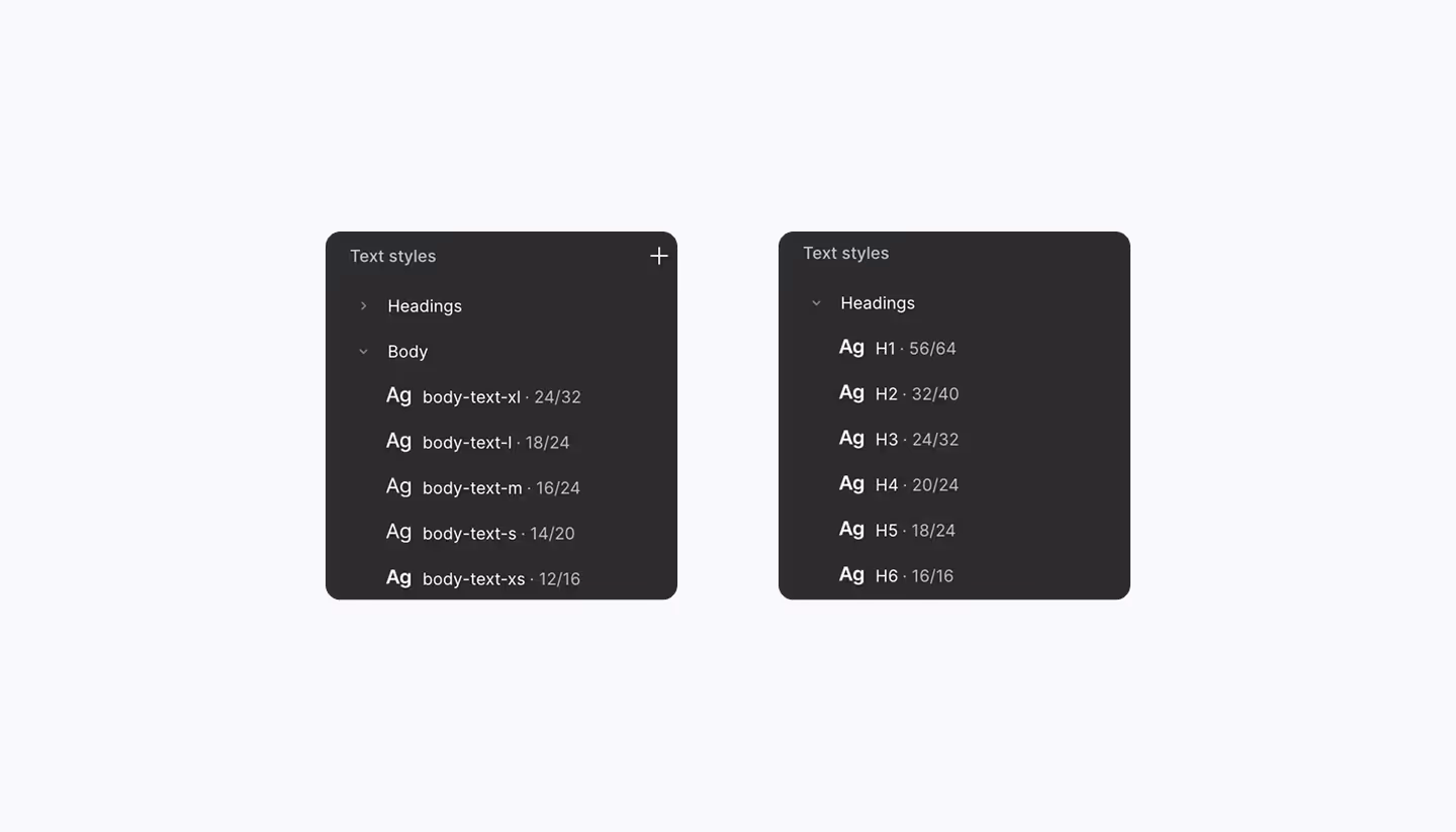
2. Text Styles
Text styles are predefined and mapped to variables, so you can apply them quickly and keep designs consistent. They are grouped into:
- Headings (H1–H6): For titles and section headers.
- Body Text (Large, Medium, Regular, Small, Tiny): For paragraphs and supporting content.
- Utility Text: Labels, captions, and small UI elements.

3. Scale & Hierarchy
Each style is sized and spaced to maintain a clear vertical rhythm across devices:
- Headings create hierarchy and guide attention.
- Body text ensures legibility in long form content.
- Small and utility styles provide subtle emphasis for labels, tags, and metadata.

4. Applying Text Styles in Figma
- Select your text element.
- In the right sidebar, open the Text Style (four dots icon).
- Choose a predefined style (e.g., Heading 3 or Body Regular).
- The text is now linked to the system — if the style updates, your text updates too.
5. Best Practices
- Use headings in order (H1 → H2 → H3) to maintain hierarchy.
- Avoid resizing text manually — always apply styles.
- Keep line length between 45–75 characters for readability.
- Use Medium or Regular body styles for most UI content.
- Reserve Small or Tiny text for labels, captions, or metadata only.
Final Words
Typography brings structure and readability to your designs. By using the predefined text styles, you ensure a clear hierarchy and consistent look across all pages. Next, we’ll cover Layouts & Spacing to see how typography works hand-in-hand with grids and spacing tokens.